For both of my themes i have used Photoshop to enhance the overall presentation of my final images. This is the most commonly used editing software that photographers use to enhance the overall presentation of their images. I first created a new layer and then cropped my images, although i had taken into consideration this factor whilst shooting.
For my fashion theme i desaturated the image and adjusted the opasity to get the desired effect that was relevent to my research
Along with the desaturate tool, i used the spot healing tool.
There are various ways of presenting images, and the final effect that you create will most certainly depend on your choice of presentation and with modern day technology evolving rapidly this gives you a wide range to choose from. The traditinal option would be to print your images and this would leave you to judge the size, type of paper (Glossy, Satin and Matt), and then followed by what frame would fit in with the theme of the image. These are generally used in unison and there are specialised shops or websites that will deal with all of these together although the design is soley up to the photographer.
The more modern ways of presenting images are respective of the fast moving technology market. These include working Blogs and slidshows on websites (such as Blogger), and the creation of the tablet (ie IPad). The digital option not only is a fresh modern new way to promote and present its also cheaper as there are no printing costs. As the editing process is done on a computer, the digital presentation method is easier to sync with websites, so keeping your images looking there best.
Photos by Tim
Thursday, 7 July 2011
Saturday, 25 June 2011
Still Life - Work in Progress
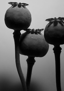
By using my own camera, some white paper, available light and flash combined i created a makeshift studio at home suitable for shooting my still life project. The following images are the best of what i have gathered from the shoot and now i have the added challenge of post processing them the the vision i had in mind when i shot them. Gathering inspiration from Imogen Cunningham, Irving Penn and Karl Blossfelt mainly i wanted to create some images that looked like they have slightly aged and are warm.
Once i started post processing these images the vision i had in mind and my first comparison:
Once i started post processing these images the vision i had in mind and my first comparison:
The Top image is from Karl Blossfelt and the second image is my recreation of this image.
Saturday, 28 May 2011
Saturday, 14 May 2011
Imogen Cunningham - Still life research
Born in the late 1800s Imogen is one of the most iconic photographers of her time. She has created some amazing work in the photography world including portraits and still life.
These two images of Lily's at a glance look similar but the are simply just a different perspective of the same thing. The use of lighting added to the simplicity of the flower creates an almost smokey appearance of the second image but the first image displays the beauty of the large petal and the shape that the lily is famed for. The black and white tones give the shadows more depth and enhance the bright pleasant colour and the curve that the petal makes.
The above image is visually pleasing and the way the petals frame the center of the flower highlights how unusual the shapes are on the stamen (not sure that's right on this particular flower). Again the black and white tones have been used but I'm guessing that to do with how old the image is.
By using Lily's, Imogen has captured some interesting shapes and the way the second image has been composed highlights this. She has opted for an in camera crop to accentuate the curves in the flower. The first image shows the dramatic change in tones from a white flower and coloured flower when the black and white effect has been used.
With this image you can instantly tell that its more of a modern image than the others i have researched, The use of colour gives this flower a warm feel and the complex petals add to the interesting shapes. The composition is simple where its a birds eye shot but works brilliantly.
These last two images are different to the flower images and her intention in my opinion is to capture the unusual shapes and lines that reflect off the subject.
Monday, 9 May 2011
Conclusion For Photoshoot 7th May
This weeks shoot went extremely well! I'm more than happy with the shoot and now Ive been in the studio a couple of times i have a little added confidence. The advantage i had in this shoot was that i knew the model and she is no stranger to the studio, that said, i cant deny how pleased i am with the results! I'm currently processing the images in photo shop but I'm going to include the shortlist from the shoot, and i use the word 'shortlist' lightly.
Subscribe to:
Comments (Atom)


